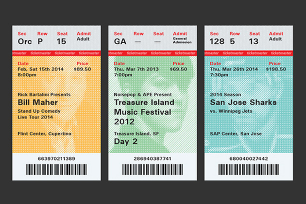
Well done. Note the use of color and blur to separate foreground from background.
Let's make our more approachable.
***
// published on The Verge - All Posts // visit site
// published on The Verge - All Posts // visit site
The trouble with Ticketmaster is all the tickets
Graphic designer Matthew Lew likes concerts, but he hates concert tickets. A student from California College of the Arts, Lew was dismayed by the poor standard of design of tickets, both from an aesthetic and usability perspective. Rather than simply complain about it, he set about creating "a redesign worthy enough to keep paper tickets in circulation."